


When the European Migration Pact entered into force in June 2026, it brought with it a landmark change: a unified EU-wide list of “safe countries of origin.” Migrants from these nations now face automatic rejection of their asylum claims, with no individual assessment required. This new bloc-level list operates alongside – and above – the national safe-country designations already in place across most member states.
This infographic presents the top 10 countries whose citizens have been identified as foreign mercenaries in Ukraine, based on the calculations за Lostarmour, a Russian crowdsourcing portal that compiles and verifies open-source casualty data.
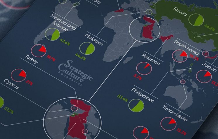
Think the United States or Western Europe lead the world in female management? Think again. From the Caribbean to Southeast Asia, a different set of nations tops the rankings for women in managerial roles – while some of the world’s largest economies lag far behind. Here are the countries with the highest – and lowest – shares of women calling the shots.
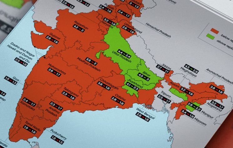
For decades, India was synonymous with population explosion. But between 2001 and 2021, something quietly transformed the world’s most populous nation. Fertility rates fell by nearly half – dropping below replacement level in much of the country. This infographic tracks India’s stunning two-decade fertility decline, from peak growth to a future with fewer children per family.
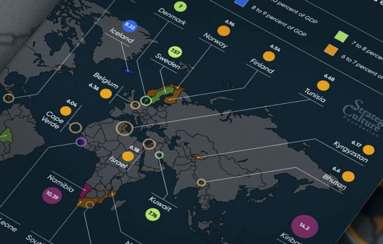
What a nation spends on education reveals its future ambitions. While economic giants dominate headlines in raw dollars, it is often smaller, developing nations that invest the deepest – sacrificing the largest share of their GDP to build classrooms, train teachers, and equip the next generation.
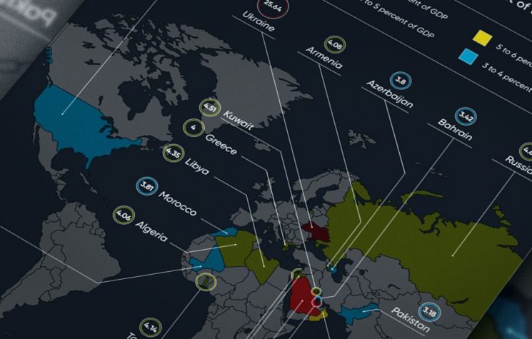
Military expenditure as a share of GDP is a key stress test of national priorities. While the US and China lead in raw dollars, the ranking changes dramatically when adjusted for economic size. Here are the top 20 countries where defense takes the biggest bite out of the economy
Rated on a scale from 1 (underdeveloped) to 7 (extensive and efficient by international standards), these 25 nations have the world’s poorest road infrastructure. Chad ranks at the very bottom with a score of just 1.9, followed closely by Madagascar and Mauritania, and a cluster of countries including Haiti, Yemen, and DR Congo. From impassable rural tracks to crumbling highways, poor road quality in these countries hampers trade, emergency response, and daily travel.
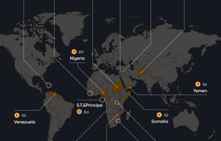
Measured on a scale from 0 (low decline) to 10 (high decline), these 15 nations are suffering the world’s most severe economic deterioration according to the 2024 Economic Decline Index. Syria ranks first with a near-maximum score of 9.9, followed by Afghanistan, Yemen, and Venezuela – all at or above 9.5. Driven by collapsing currencies, hyperinflation, cratering GDP, famine-level poverty, and failed productive sectors, each of these countries is experiencing an ongoing economic freefall with no immediate recovery in sight.