


contributors
Strategic Infographics

all articles


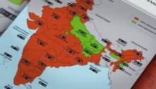
Think the United States or Western Europe lead the world in female management? Think again. From the Caribbean to Southeast Asia, a different set of nations tops the rankings for women in managerial roles – while some of the world’s largest economies lag far behind. Here are the countries with the highest – and lowest – shares of women calling the shots.
For decades, India was synonymous with population explosion. But between 2001 and 2021, something quietly transformed the world’s most populous nation. Fertility rates fell by nearly half – dropping below replacement level in much of the country. This infographic tracks India’s stunning two-decade fertility decline, from peak growth to a future with fewer children per family.

What a nation spends on education reveals its future ambitions. While economic giants dominate headlines in raw dollars, it is often smaller, developing nations that invest the deepest – sacrificing the largest share of their GDP to build classrooms, train teachers, and equip the next generation.

Military expenditure as a share of GDP is a key stress test of national priorities. While the US and China lead in raw dollars, the ranking changes dramatically when adjusted for economic size. Here are the top 20 countries where defense takes the biggest bite out of the economy

Rated on a scale from 1 (underdeveloped) to 7 (extensive and efficient by international standards), these 25 nations have the world’s poorest road infrastructure. Chad ranks at the very bottom with a score of just 1.9, followed closely by Madagascar and Mauritania, and a cluster of countries including Haiti, Yemen, and DR Congo. From impassable rural tracks to crumbling highways, poor road quality in these countries hampers trade, emergency response, and daily travel.
Measured on a scale from 0 (low decline) to 10 (high decline), these 15 nations are suffering the world’s most severe economic deterioration according to the 2024 Economic Decline Index. Syria ranks first with a near-maximum score of 9.9, followed by Afghanistan, Yemen, and Venezuela – all at or above 9.5. Driven by collapsing currencies, hyperinflation, cratering GDP, famine-level poverty, and failed productive sectors, each of these countries is experiencing an ongoing economic freefall with no immediate recovery in sight.

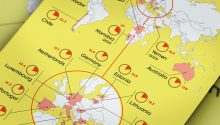
Measured on an index where the world average equals 100, these 20 nations have the highest price levels for goods and services according to the World Bank’s Cost of Living Index. Bermuda tops the list at nearly 213—more than double the global average—followed closely by Switzerland, Iceland, Israel, and Norway. From housing and groceries to transportation and utilities, everyday expenses in these countries far exceed those anywhere else on the planet.

Scored on a scale where higher numbers mean deeper crisis, these 20 nations rank as the most vulnerable on Earth according to the Fragile States Index. Leading the list is Somalia, followed by Sudan) and Syria. All 20 suffer from intense pressures including active conflict, collapsed public services, mass displacement, and severe economic decline—marking them at the highest risk of state failure. The indicator is available from 2007 to 2024.
From sun-drenched deserts to equatorial highlands, a growing number of countries now generate over 10%—and in some cases nearly 30%—of their electricity from solar power. The unlikely leader is Lebanon—a nation in the throes of state collapse. With its national grid delivering just a few hours of power per day and the central government functionally bankrupt, Lebanese citizens, businesses, and hospitals have turned rooftops into power plants. This infographic shows the share of solar in electricity generation.

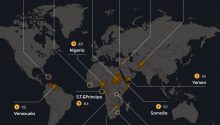
When a nation’s most educated, ambitious, and skilled citizens pack their bags, the loss goes far beyond population numbers – it bleeds future doctors, engineers, entrepreneurs, and leaders. This infographic visualizes the Human Flight and Brain Drain Index, a key fragility indicator that tracks mass emigration of talented workers.